Work
LH Home Ltd.
Marketing Strategist | October 2018 - Present

LH Home Ltd.
Marketing Strategist
A B2B furniture wholesaler where I have progressed from handling claims to managing eCommerce to creating marketing content and now to developing marketing strategies and overseeing IT operations.
I took charge of project initiatives like improving the company’s website experience and streamlining integration for better workflows. I also established processes and information organization to enhance the team’s efficiency and product knowledge.
Tools
Adobe Illustrator, Adobe Indesign, Adobe Photoshop, Canva, Buffer, MailChimp, Formstack, Typeform, Shopify, SAP B1UP, SQL
Timeline
October 2018 - Present
Skills
Project Management, Ideation, Iterative Design, User Testing
Website
In 2019, LH's outsourced web developer shut down their business, and LH needed a new website. I led the redesign, focusing on branding, usability, and improving the online ordering experience for B2B users. The goal was to create a more intuitive, efficient, and partner-oriented platform that aligned with their needs.
Final Prototype
quick short video of the website
User Research
I’ve conducted two rounds of user research interviews with 10 users each round (4 internal staff, 3 designers, and 3 retailers) ranging from 27- 65 years old. Participants were asked to complete a series of tasks on the website while sharing their challenges and frustrations throughout the process.

Insight


Market Research
I reviewed how furniture eCommerce sites present and categorize products. This included competitors, popular furniture platforms, and our own partners. The goal was to identify common patterns and terminology so our website could align with user expectations and industry standards


Takeaway
After looking at other website layout, LH Home's website was missing:
Product types that are organized and separated by room setting
Conventional wording for room-based navigation such as bedroom, living room, office, etc.
Product information table that lets users quickly toggle between specifications.
I focused on these three points that came up frequently in user interviews.
Problems


The website created uncertainty and confusion, leading partners to contact staff instead of using the website.
Ideation
I redesigned the sitemap and navigation to improve usability and guide users more effectively.

Currently, LH featured new products and sales only on the homepage. However, users have different shopping priorities. I proposed adding Sale, New Arrivals, and In Stock sections to the main navigation for easier access.
Solution
Instead of creating an entirely new layout, I built on the existing design that users were already familiar with. I introduced updated navigation and a more polished visual style to ensure a smooth transition. I also added a product information table on the Product Page and collaborated with a third party developer to create a solution for managing user-specific price visibility more effectively.
Requirements


Low Fidelity
I created simple wireframes in Figma based on LH’s previous website and market research insights. I selected a Shopify theme that matched the brand’s identity and functional needs, then customized key pages within Shopify’s constraints to deliver a cohesive and user-friendly experience that supports business goals.
Home Page and Navigation Layout


Product Information Table
I designed and built a dynamic product information table using HTML, CSS, and JavaScript. To automate daily updates, I configured Shopify meta fields and collaborated with a third-party integration team to map them to our system’s user-defined fields. This reduced manual work, improved data accuracy, and gave customers real-time product information.

Feedback and Changes Made
After three months, we used user feedback to make some additional adjustments.
Toggling Between Dimensions, Details, and Features
Users found switching between tabs inconvenient. I consolidated key details into a single, scrollable section to make information easier to access.

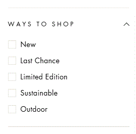
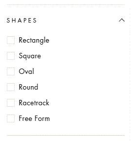
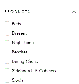
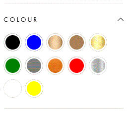
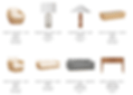
Filtering by Color, Shape, and Product Type
Users wanted more control over product selection to refine their search. I added filters for colour, shape, and product type on the product listing pages to help users find what they needed more easily.
Stock and ETA Visibility
Users wanted to see stock levels and delivery dates without clicking into each product. I added stock availability and ETA directly to the product listing and search results, making it easier to check product status at a glance.
Metrics
Post-launch, I measured user satisfaction through qualitative feedback from both customers and the support team, tracked order volume through the website, and monitored feature usage over time to assess retention. These insights helped evaluate the redesign’s impact and informed future improvements.
Measuring User Experience Success
User Satisfaction
Order Completion Rate
Retention Rate
Measuring Positive Business Outcomes
Increase Online Orders
Reduced Customer Support Inquires
Marketing Tool
Edge Cases
While working on this project, I identified several edge cases that extended beyond the initial scope. Some were addressed during the redesign, while others remain part of future roadmap discussions.
Ordering features
Bulk order flow
Custom order flow
Quick reorder from past History
Favourite List Feature
AR
Live chat
Seamless onboarding process.
Takeaways
Summary
The previous website created friction for both partners and internal teams. Through user research and competitive analysis, I redesigned the site to improve navigation, streamline the ordering process, and ensure accurate pricing visibility based on user type. The goal was not just a visual refresh, but a more intuitive and scalable platform that supports LH’s B2B needs.
Challenges
This was my first time working within Shopify's theme constraints and meta field system. Balancing flexibility with platform limitations required close collaboration with developers and creative problem-solving, especially for custom pricing rules and a tailored solution for US and CA currency. Through trial and error, I learned how to use its tools to meet LH's needs.
Lessons Learned
Designing with scalability in mind is essential, especially for teams managing content day-to-day.
Not everything needs to be redesigned from scratch. Building on familiar layouts can ease transitions and improve adoption, and leveraging existing app solutions can be more cost effective.
User testing is essential at every stage to ensure the design continues to serve both user needs and business objectives. It also uncovers new use cases and edge scenarios.
Marketing Assets
Problem
Product lines often underperform due to a lack of strong visual assets. Common issues include:
Poor quality product photos
Lack of relatable lifestyle imagery
Customers can’t visualize items in their own spaces
Unclear context or product visualization
Solutions
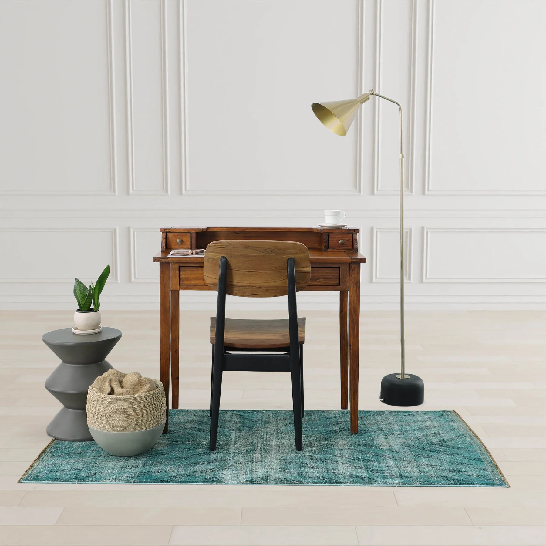
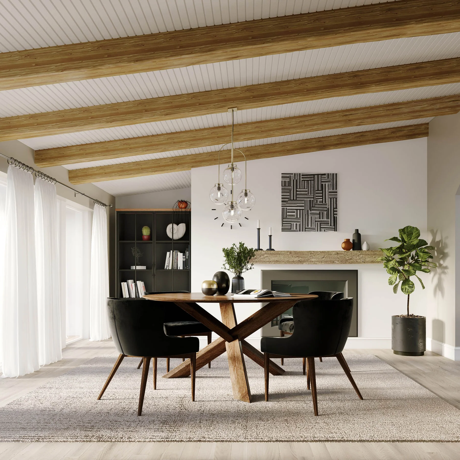
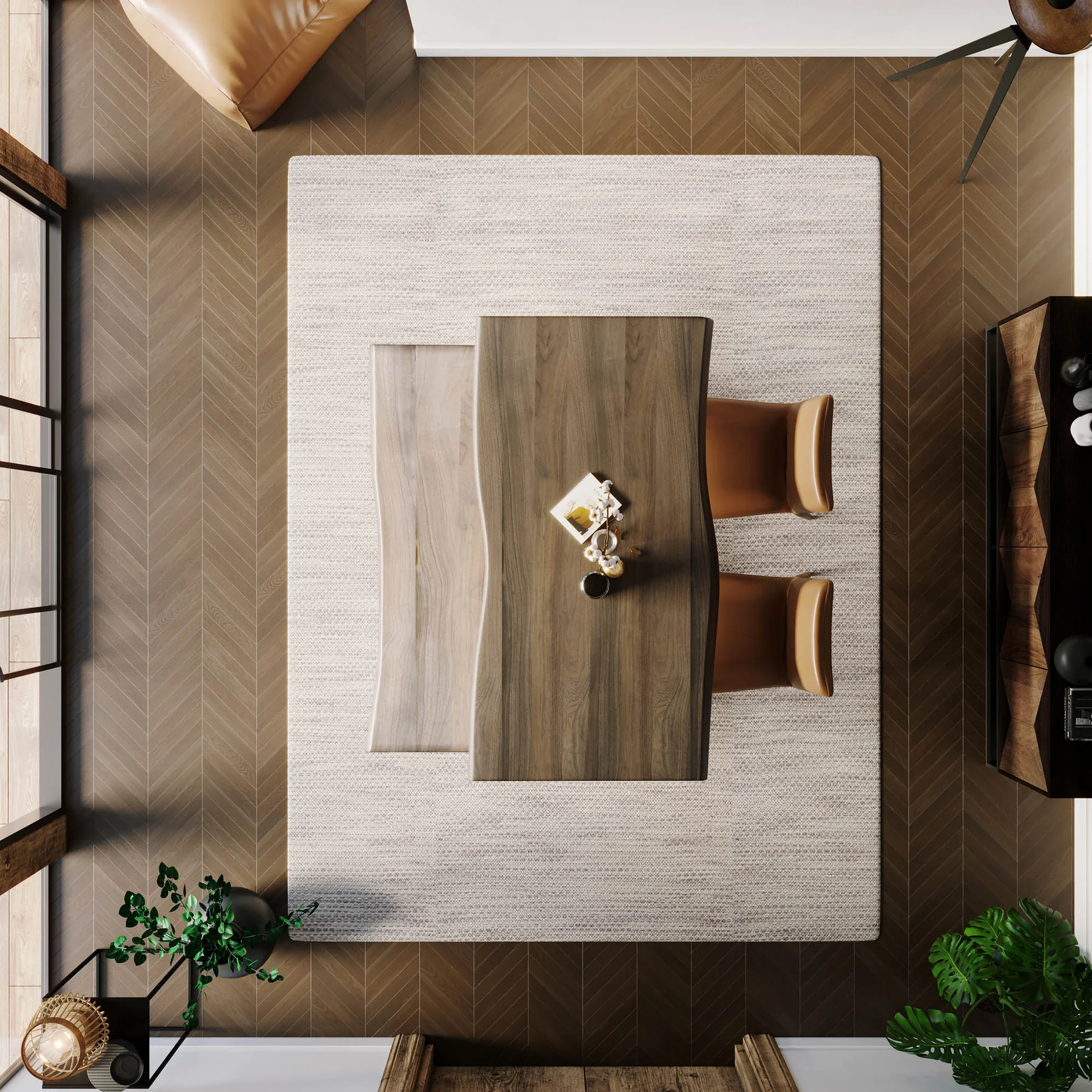
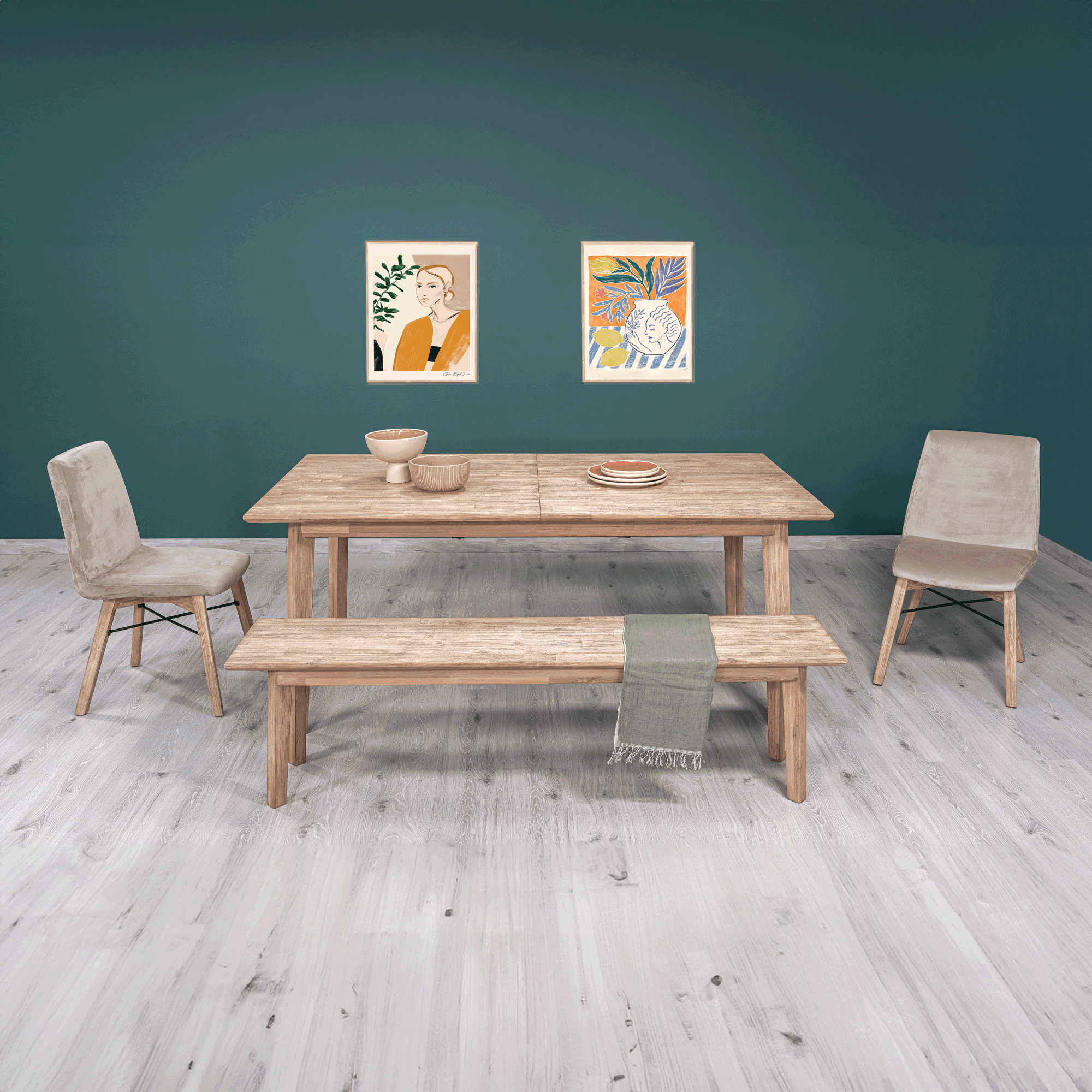
To improve product presentation, I initiated a multi-pronged approach. I created a visual guideline manual for our factories, inspired by Wayfair’s product imagery guidelines, to communicate what types of images we needed and why it benefits them too. I advocated for and introduced Canva to streamline the creation of marketing visuals, making it easier to tell compelling and relatable product stories.
To build a stronger image library, I launched a customer incentive program encouraging partners to share their professional photoshoots in exchange for perks. I worked with a few rendering companies to create realistic lifestyle imagery. Now together with a team, we are using tools like ChatGPT and Prezi AI to help generate lifestyle imagery that feels authentic and tailored to our audience, making product presentation more engaging and scalable.
The purpose of these visuals was to make our products more relatable and to demonstrating how our products help end consumers become who they want to be.
Storytelling Content
Most of our story content was done through social media with Instagram as our main platform. goal.


AI Generated & 3D Rendering Lifestyles
One of the feedback LH constantly receive is our electric style and curated floor sets. At the same time one of the bottlenecks for our retailer have is also imagery for their customer that captures end consumer's attention.


eCommerce & SAP Queries
2019 – 2020
In 2019, I was assigned to lead the data and operation side of our eCommerce initiative, with a focus on optimizing our product information for third-party marketplaces—particularly Wayfair.
Product Data Restructuring
I reviewed how our product information was organized. After meeting with eCommerce partners, I identified specific data structure requirements and reorganized our internal product data architecture to improve compatibility and clarity. This included:
Defining and implementing an improved information architecture
Collaborating with Forgestik and a co-worker to write SQL queries
Creating cleaner product exports tailored to each platform’s needs
These efforts improved our product presentation across channels, resulting in a 200% increase in Wayfair sales in 2019 and a growth of an additional 40% in 2020 as we improved on product knowledge.
2020 – Present
This project became a turning point where I began to develop an interest in SQL and data analysis.
Data Integration & Field Mapping
I worked closely with the eCommerce and technical teams to set up integration protocols and field mapping between our internal systems and marketplace platforms. This ensured data such as product specs, pricing, and inventory synced accurately and consistently.
Inventory & Tariff Data Analysis
Based on the purchasing team request, I created an inventory tracking query specifically for tariffs between the United States and Canada. This helped the team analyze which product lines would be affected the most and more accurate data of our product demands in these 2 countries.
Dashboard
Now in 2025, together with a co-worker, we're working on our sales dashboards.
Email Campaigns
July 2022 – July 2023:
Through experimentation with some A/B testing and customer feedback, I increased the average open rate from 38% to 49% and click-through rate from 2.18% to 2.4%.
During this period, I worked on the copywriting and layout design for a variety of campaigns, including:
Tradeshows
Promotions
New Arrivals
Each campaign was tailored to its purpose. Some emails focused on a single, clear call-to-action, while others took a newsletter-style approach to provide broader updates. I monitored user interaction data, including click maps, to understand which content and layouts resonated most with our audience.
2024 – Present:
Now with a marketing team, we expanded our strategy to include:
Audience segmentation and email automation to deliver personalized customer journeys (e.g. onboarding flows, interest-based content).
More robust A/B testing, now experimenting with tone, visuals, and layout variations.
Collaborative content development with a stronger focus on performance-driven design and messaging.
This team-driven approach has allowed us to scale our campaigns and refine our strategy with greater impact and consistency.